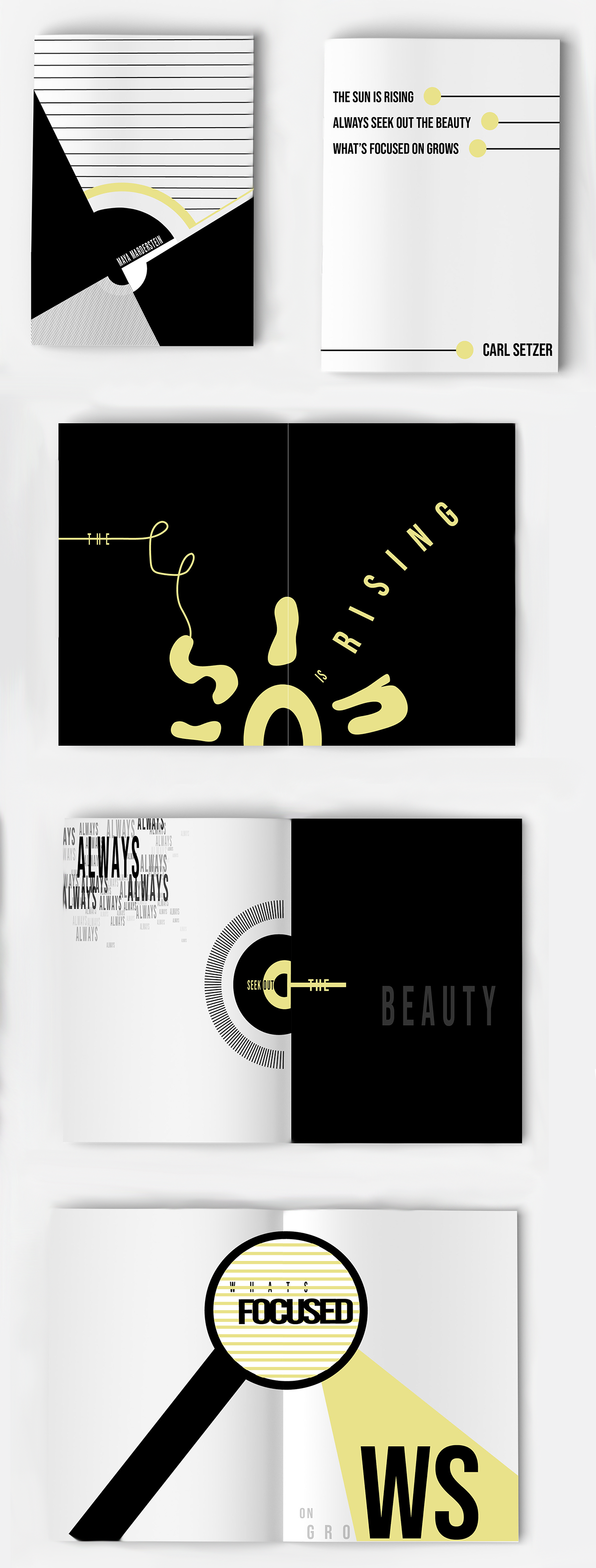
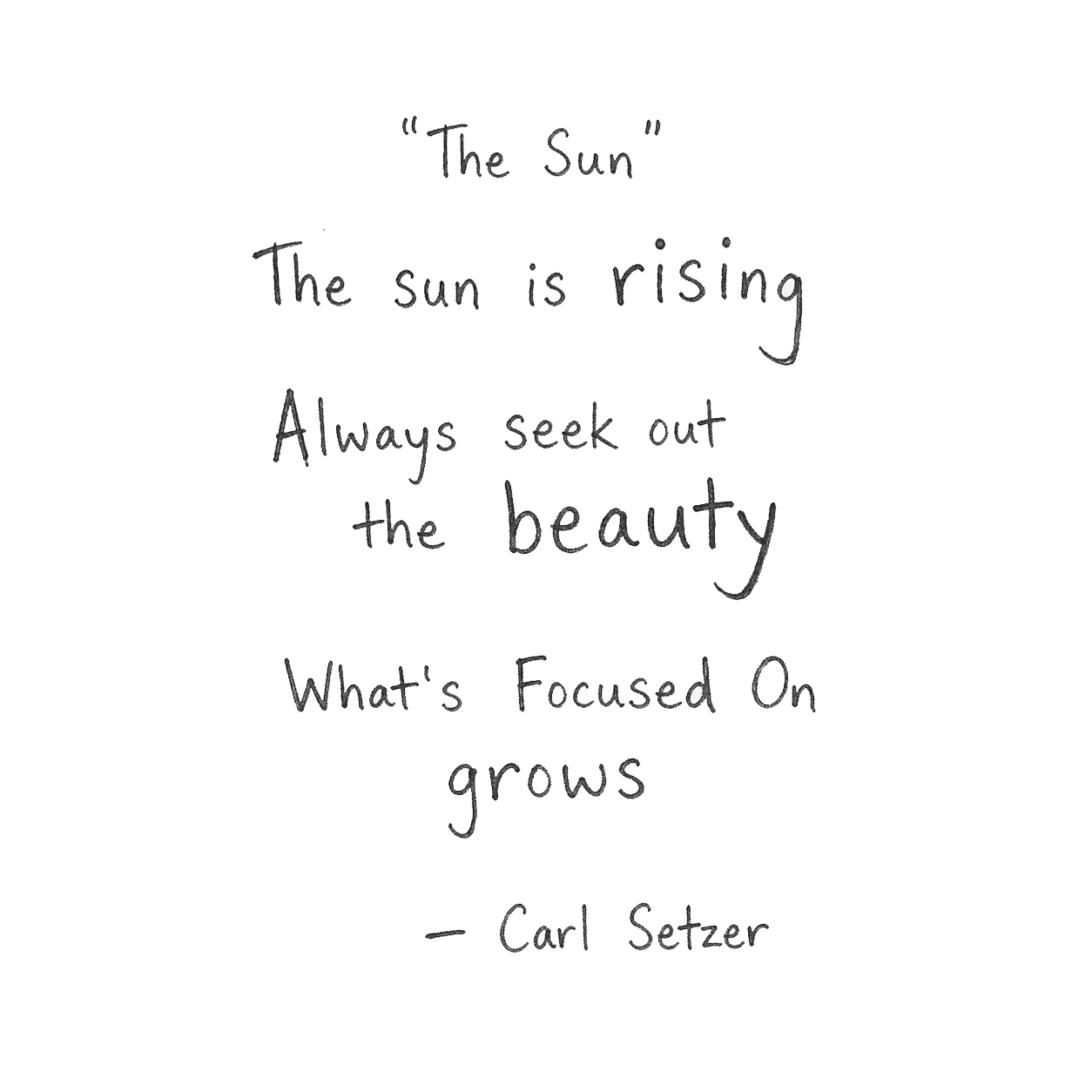
“The Sun” Haiku Booklet
I developed a visual reinterpretation of the haiku “The Sun” by Carl Setzer, using visual and typographic storytelling inspired by the structure of a traditional three-line Japanese haiku.
Illustration
Chromatic Language
Asymmetrical Balance
Visual Rhythm
Design Goals
01
Capture the Tone
Capture the feeling of the haiku through a minimal visual atmosphere that speaks for itself.
02
Use layout and pacing to mirror the rhythm and simplicity of a traditional three-line haiku.
Maintain Haiku Structure
03
Consistency & Asymmetry
Create a cohesive visual language through restrained typography and intentional use of negative space.
Sketches
In response to my haiku, I posed the question: How can I convey its essence without directly revealing its meaning? This became the foundation for my design process.
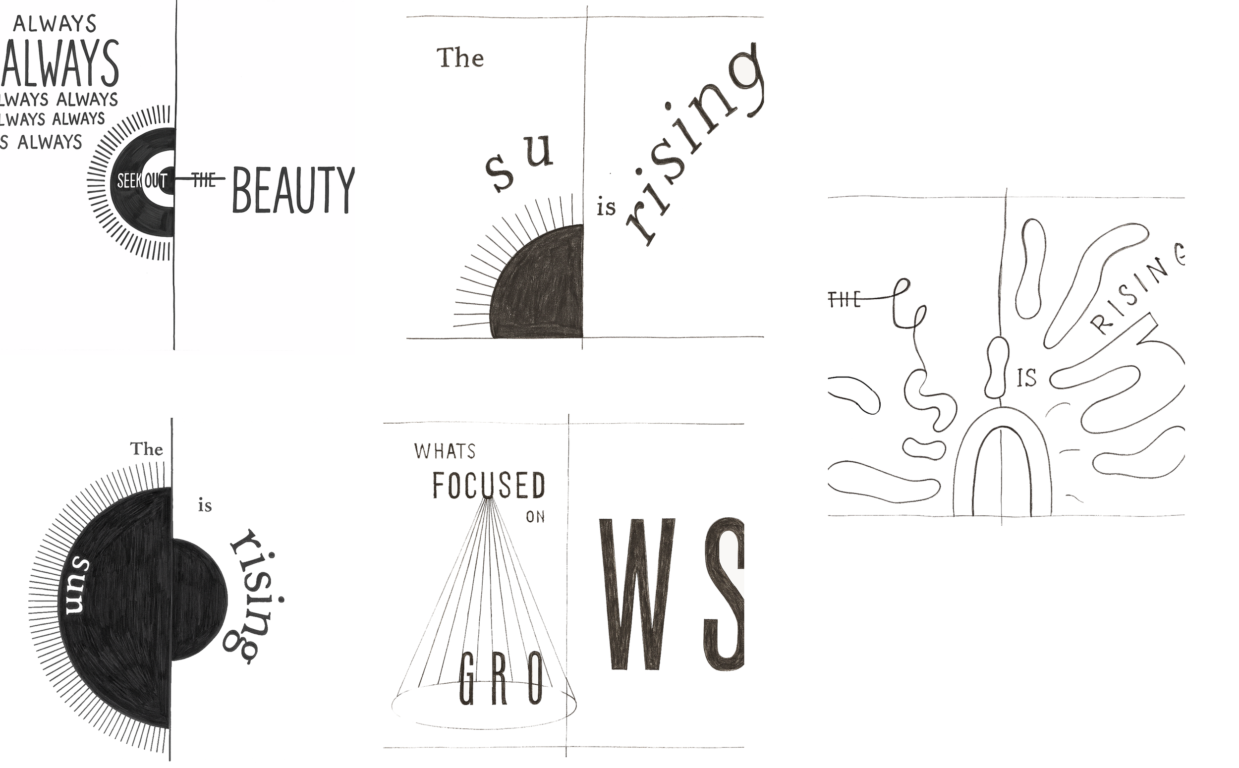
Digital Ideations
I translated my sketches into digital form and explored different layouts, type, and scale. Each version builds on the last to refine the idea.
Final Booklet
The front and back covers establish a consistent visual language that carries throughout the booklet, creating a cohesive system from beginning to end.
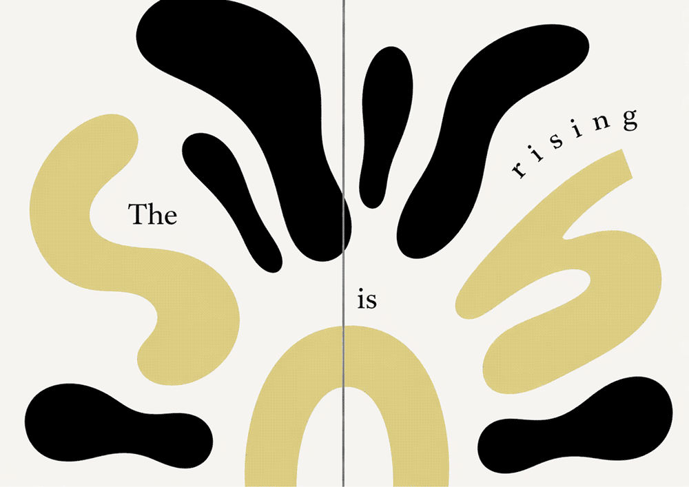
Pages 1–2
Layered typography forms an abstract interpretation of the sun, using overlap and density to build shape. The rising text extends across the spread, reinforcing the idea of movement and transition while guiding the viewer forward.
Pages 3–4
The repeated typography of “always” becomes intentionally chaotic, reflecting how perspective can feel cluttered or overwhelming. Along the spine, an abstract eye subtly emerges, acting as a visual cue to shift focus and uncover meaning—pointing to the idea of actively seeking beauty.
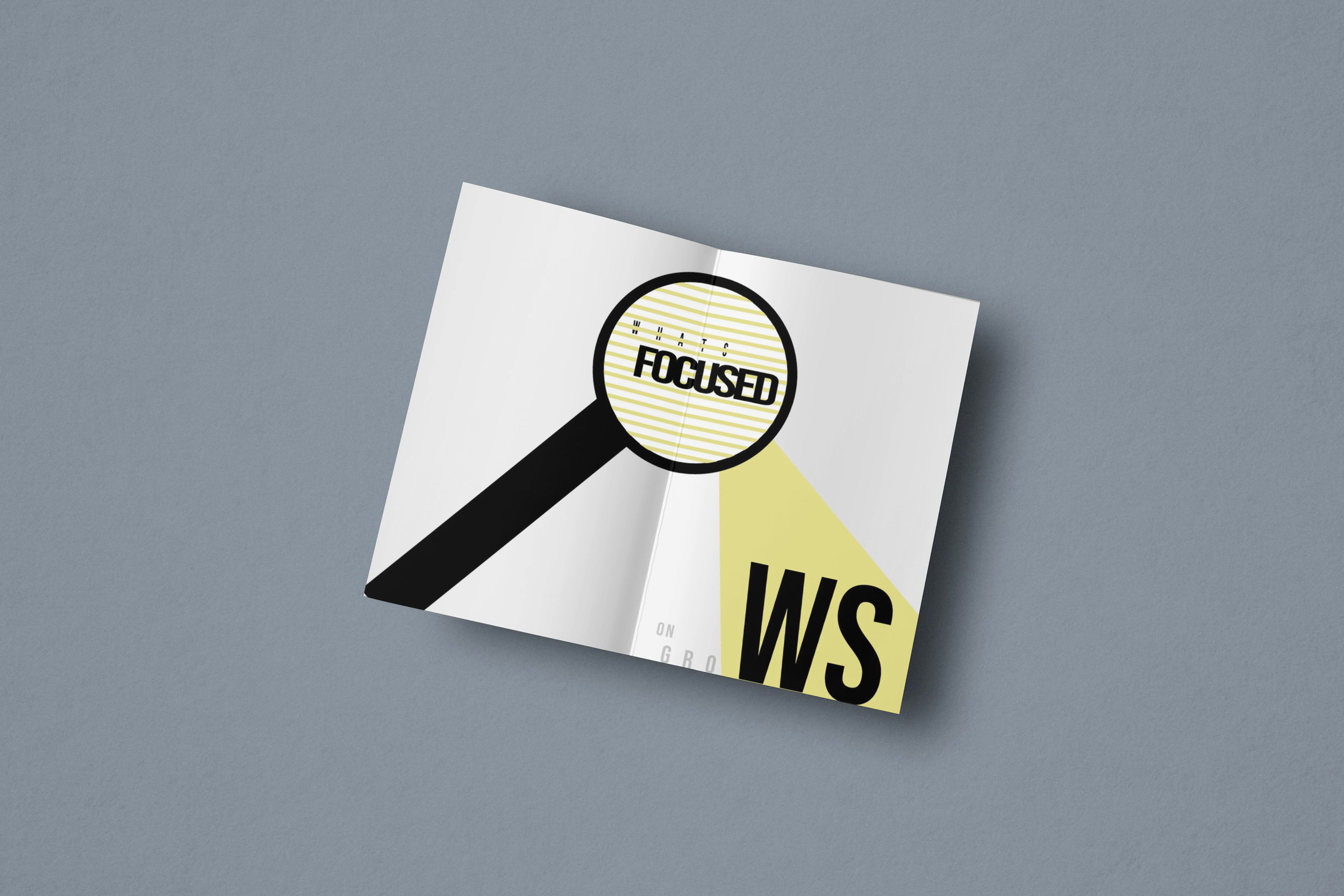
Pages 5–6
The magnifying glass symbolizes intentional observation. It emphasizes that meaning and beauty are often not immediately visible, but revealed through closer attention and a shift in focus.