Atlanta Airport Mobile App
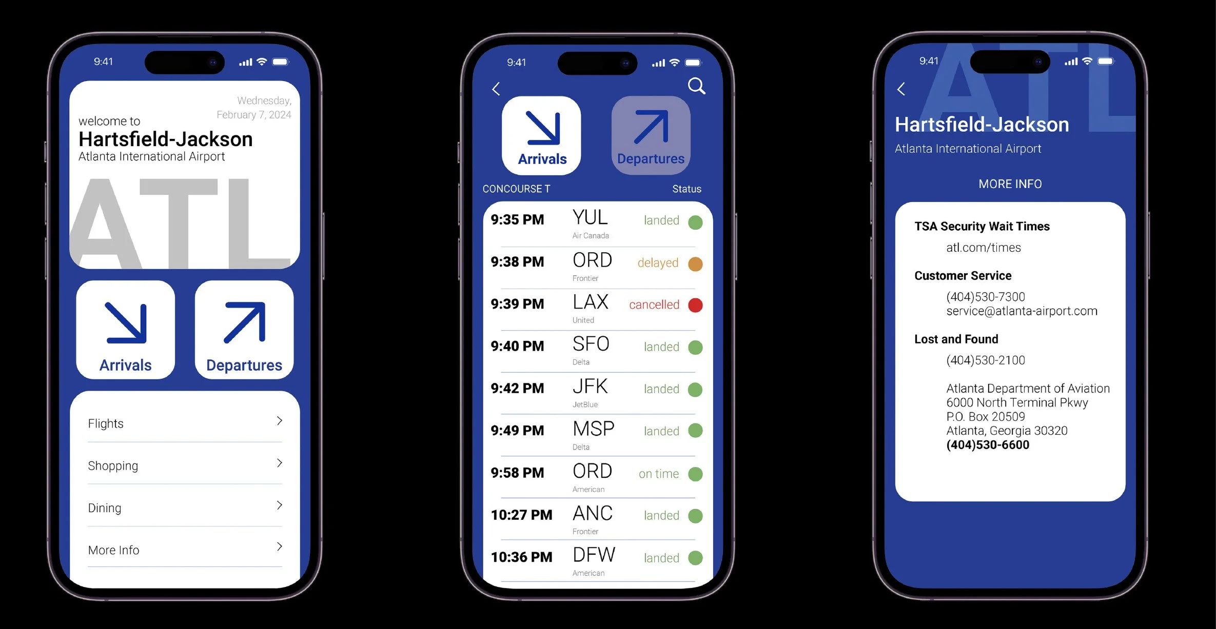
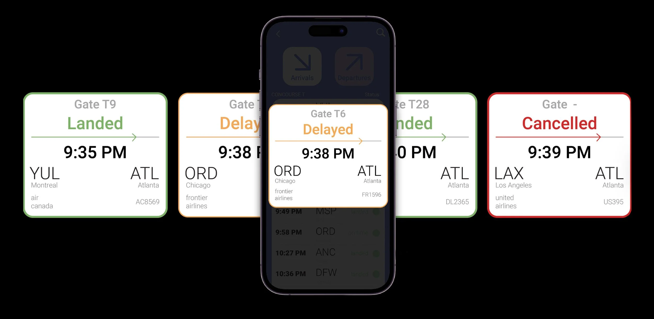
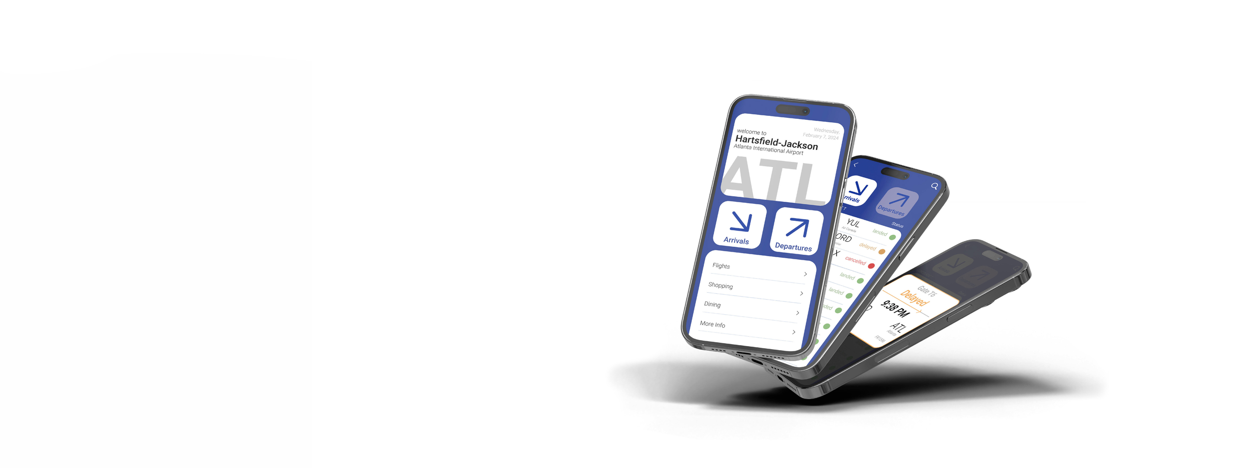
I developed a FIDS (flight informational display system) to be viewed on a phone to communicate flight details to passengers in real time.
UI Design
Prototyping
Brand Strategy
Design Systems
Design Goals
01
Establish a Clear Information Hierarchy
Identify design elements to organize critical travel information, allowing users to quickly scan and process content in a fast-paced environment.
02
Balance Utility with Brand Expression
Integrate visual personality through color and type while maintaining clarity and function.
03
Maintain consistency in gestures, buttons, and navigation behaviors to build familiarity and reduce learning friction.
Standardize Interaction Patterns
Audience Profile
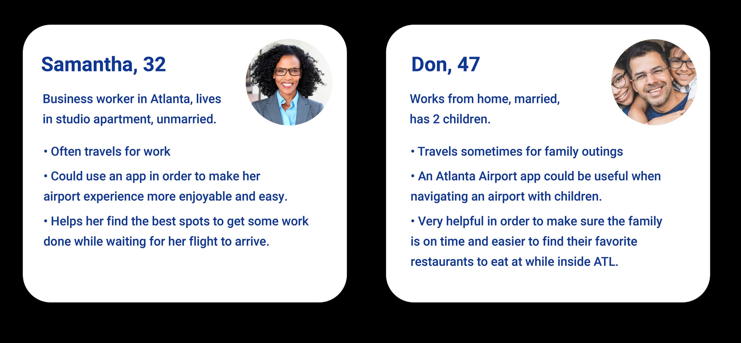
This app is intended for frequent travelers (30–50) who value speed, clarity, and efficiency. The interface prioritizes quick, glanceable information and intuitive navigation to support fast decision-making in a high-pressure airport environment.
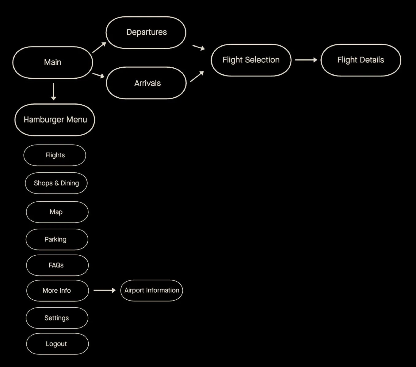
User Flow
The user flow is designed to streamline access to essential airport information by minimizing steps and reducing decision friction.
The goal is a clear, intuitive journey that allows users to quickly move from browsing to actionable information.
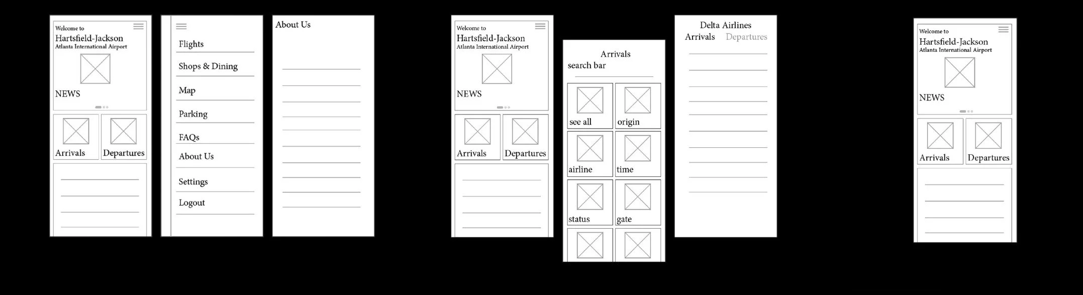
Wire Frames
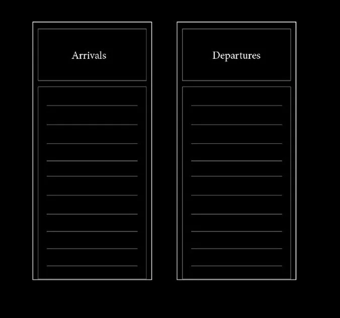
A hierarchical structure proved to be the most effective organizational system for this design. It keeps the layout clean, consistent, and easy to navigate while clearly prioritizing information.
Linear Structure
Web Structure
hierarchical Structure
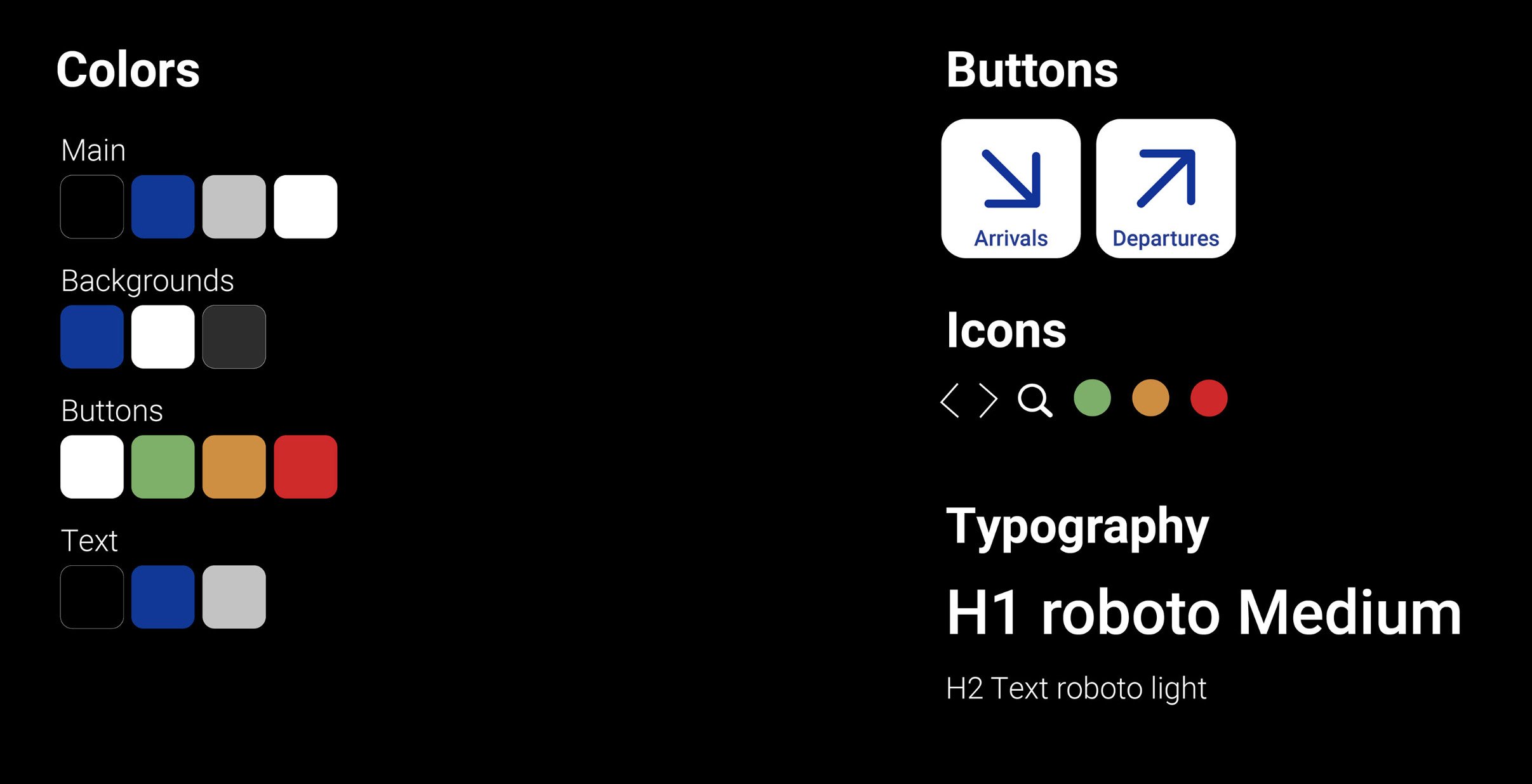
Design System
A primary color palette (red, blue, yellow) with green as a secondary accent is used to clearly differentiate actions and guide attention. Buttons use bold color and simple iconography to create recognizable interactions and support efficient navigation.
Final